FlashNgo Design
Here are screenshot of what we wish the App would look like. As you can see, it is based on your flow, with some minor changes and the design in upgraded in what we would like, more neutral colors, and some tweaking.
I hope it is as easy to make as we make this, but only you can tell.
Please get back to me refering the screens numbers to see what we can do...
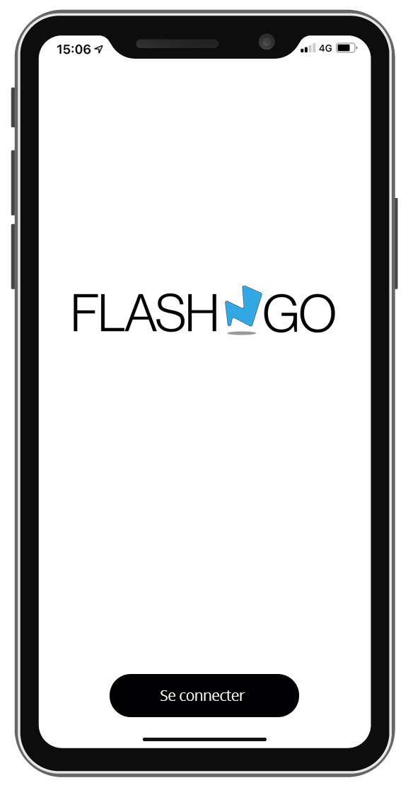
1. SplashScreen
For the moment, we intend to stay on a fixed screen, maybe later will be an animation to add.
Please note that the blue color is only on the N , and it won’t be reflected on the rest of the App.
We intend to have an app as neutral as we can to fit any brand, since we cannot customize the colours in the dashboard (that would be a great new feature, but not mandatory).
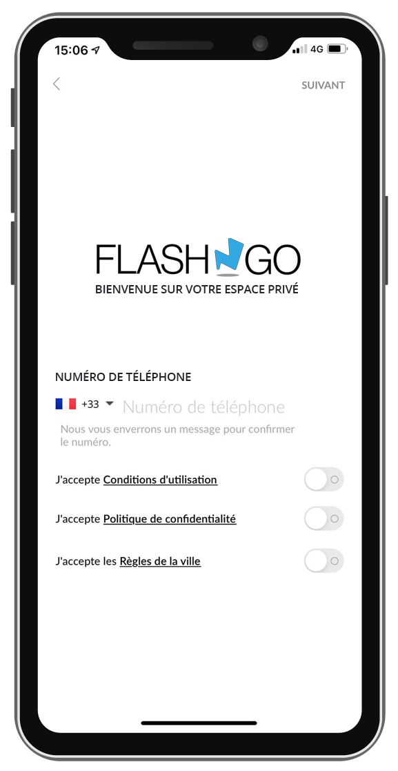
2. Phone number registration
As you can see, we would like to get nicer buttons. I told my design that we only have one Terms And Conditions, he did not update yet.
However, very important is to get he +33 by default.
By the way, there is a bug with the +33 selection, if we select +33 and then tap on the phone number to enter it, it does not keep the +33 !
Also, can you remove all the countries that are not in the system so we don’t get a list of 180 countries when only 10 are OK !!! ??!
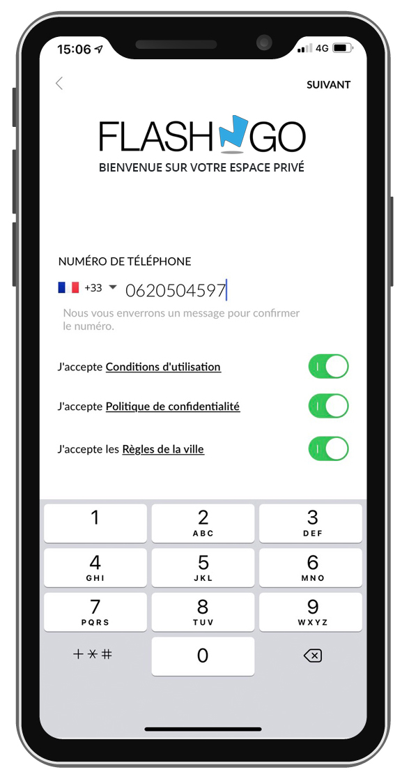
3. Phone number registration
Now you can see the colors of the buttons, and the keyboard.
Q : is it easy to add more “terms”, as you can see here there are three lines when currently there are only 2 ?
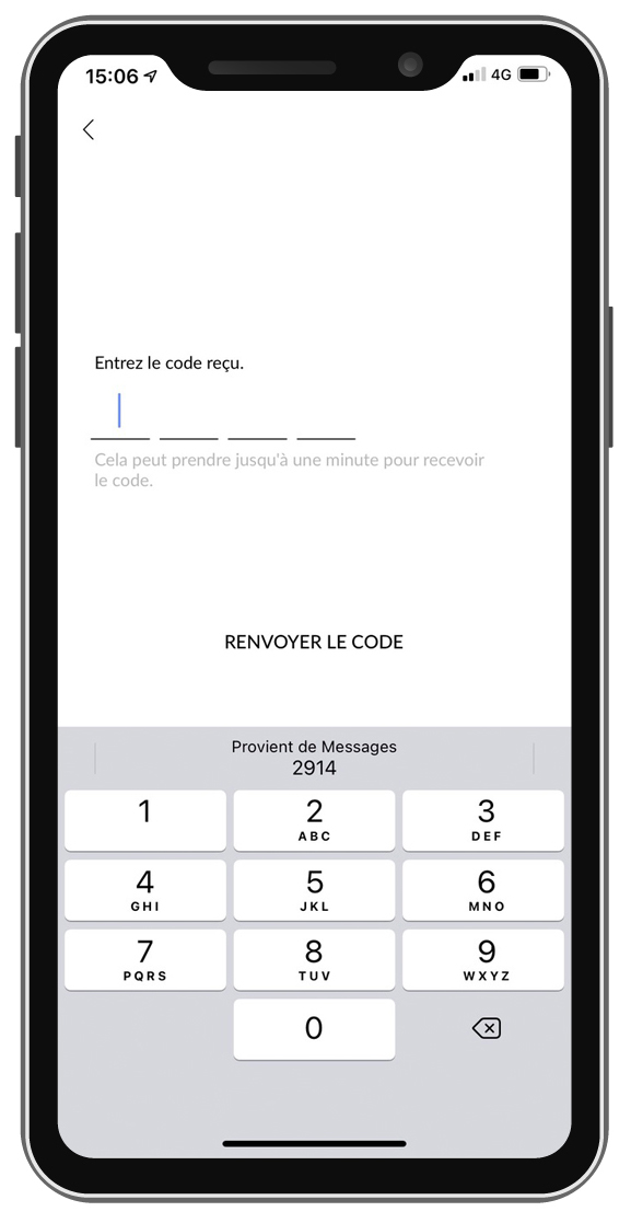
4. receiving the code from TXT
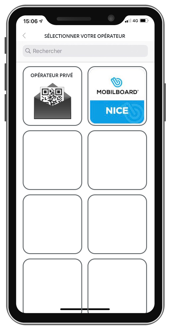
5. The system selection screen
This screen is very important. As you can see the layout we wishes is a bit different.
I realize now that it is not very likely to get 7 operators in the same place, so is it possible once we have registered to a system, that this systems keeps appearing even when we are hundreds of miles away from it ?
Otherwise, we could imagine then having the “join a private system” that is taking a full line (two tiles).
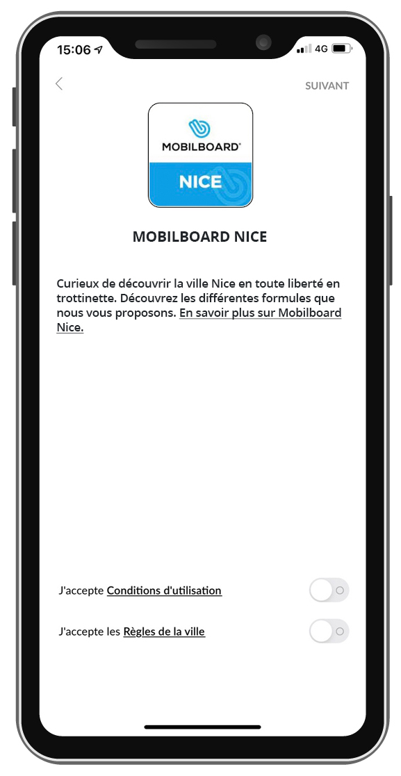
6. Information page on the system once selected
Not many variations, mainly the continue button on the upper right and the arrow and multiple terms and conditions if possible.
Also, can we put HMTL in the description in order to add a map for example ?
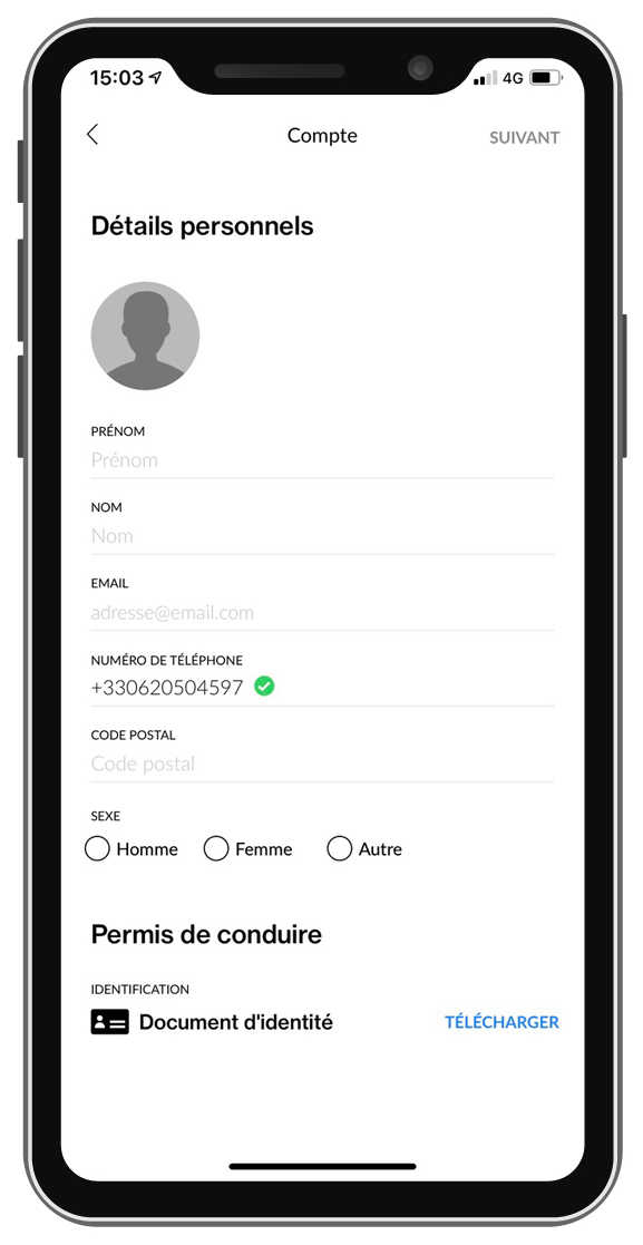
7. Personnal data fields
Informations based on the fields that we can add in the Dashboard settings.
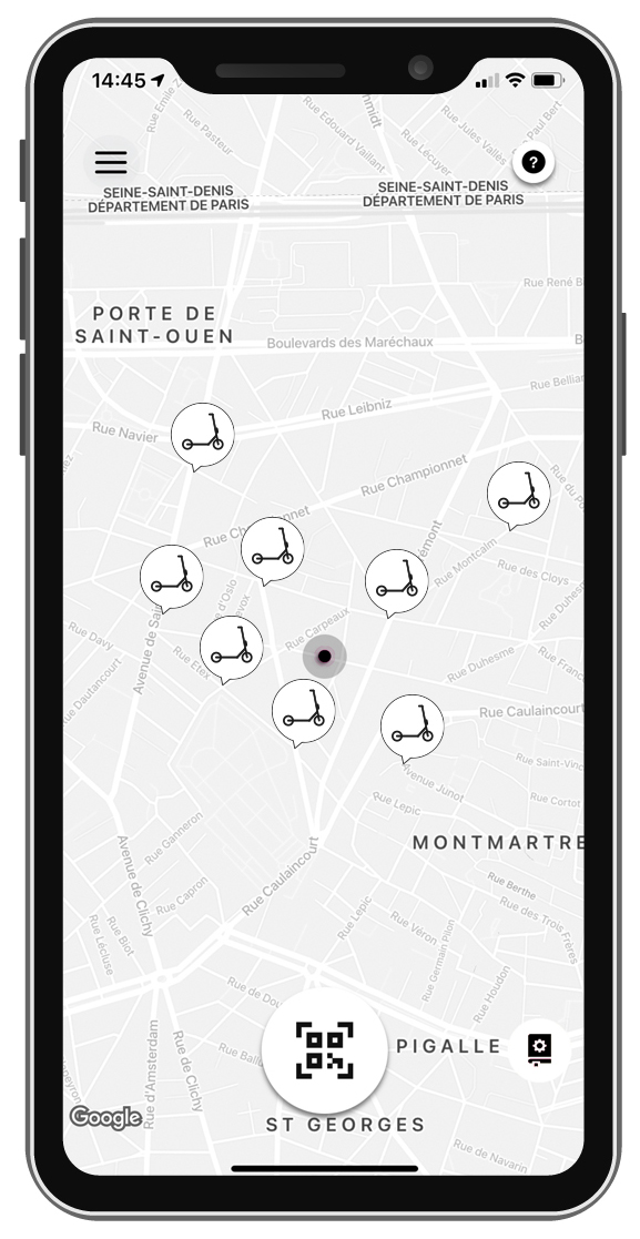
8. Map with scooters
See colors and icons.
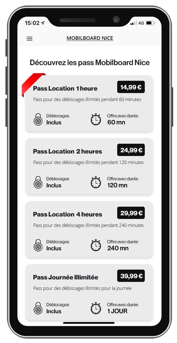
9. Plan selection
This is the most critical page we would like to see an evolution.
That would be great to have :
System name on top
A tag line
And the tiles with all the plans with :
- the price
- the “free time”
- the name
- some description
- some other feature (subscription maybe) where the lock is.
and the selected plan either on a other color or with a ruban a bit like this.
Also, the fact that we can sort the plans in the dashboard as we please is very very important.
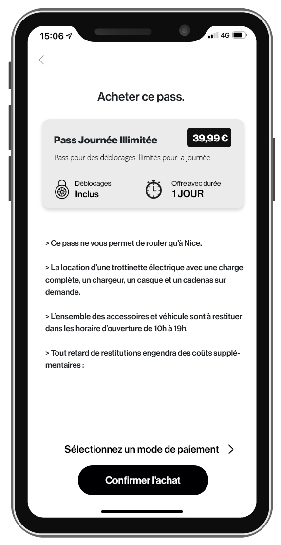
10. More informations on the plan (new screen)
We would need to have a second page where we could had much more informations on the specific plan, with the specific informations related to the plan…

11. Credit card registration
More or less classic.
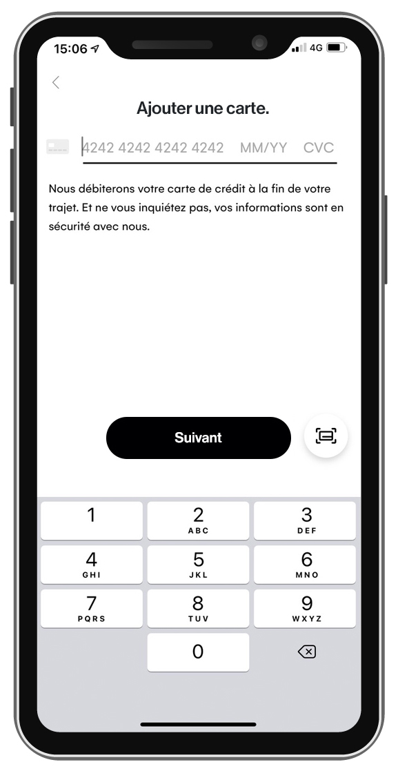
11. Entering the CC number
You can see the design, straight forward..
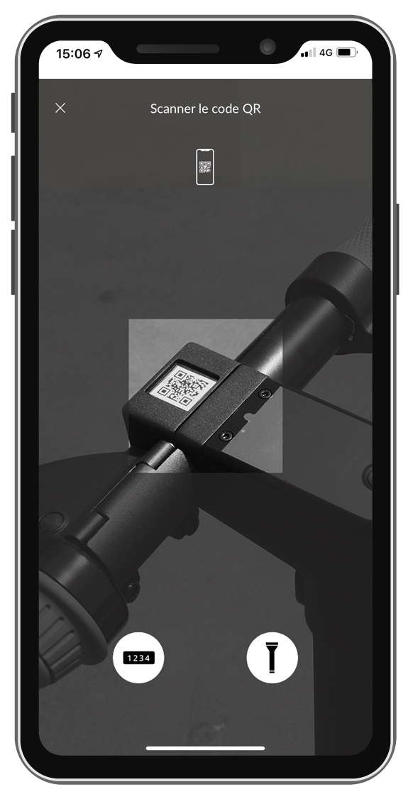
12. QRCode scanning
Pretty simple also.
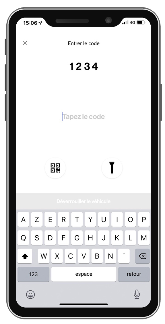
13. Code activation for the kickscooter
nothing to add.
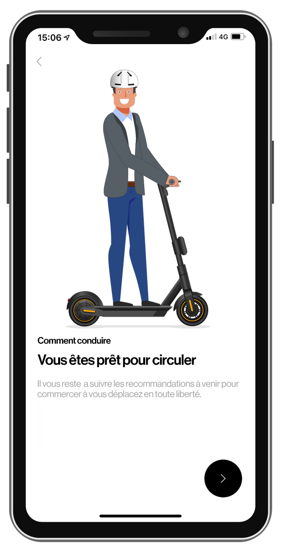
14. Explanation screens
Pretty simple screens, mostly the back arrow is different, and next button also. Font and sizes.
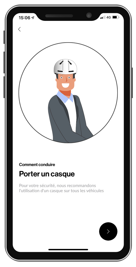
15. explanations.
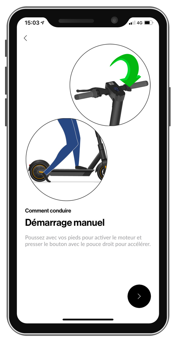
16. Explanations
OF course, there would be other screens after...