
FlashNgo V1.0 comments
Well, this is a good first start, but there are many issues mainly related to translation. Since it was quite difficult in the translation file to know where each line was supposed to go, there are some errors.
Also, there are issues with buttons.
And to finish, many many times, when the rental is finished, we get the screen telling us how much we were charged and the the app crashes and disapears.
If possible, the right way to write FlashNgo is with all attached with a small G : FlashNgo thx
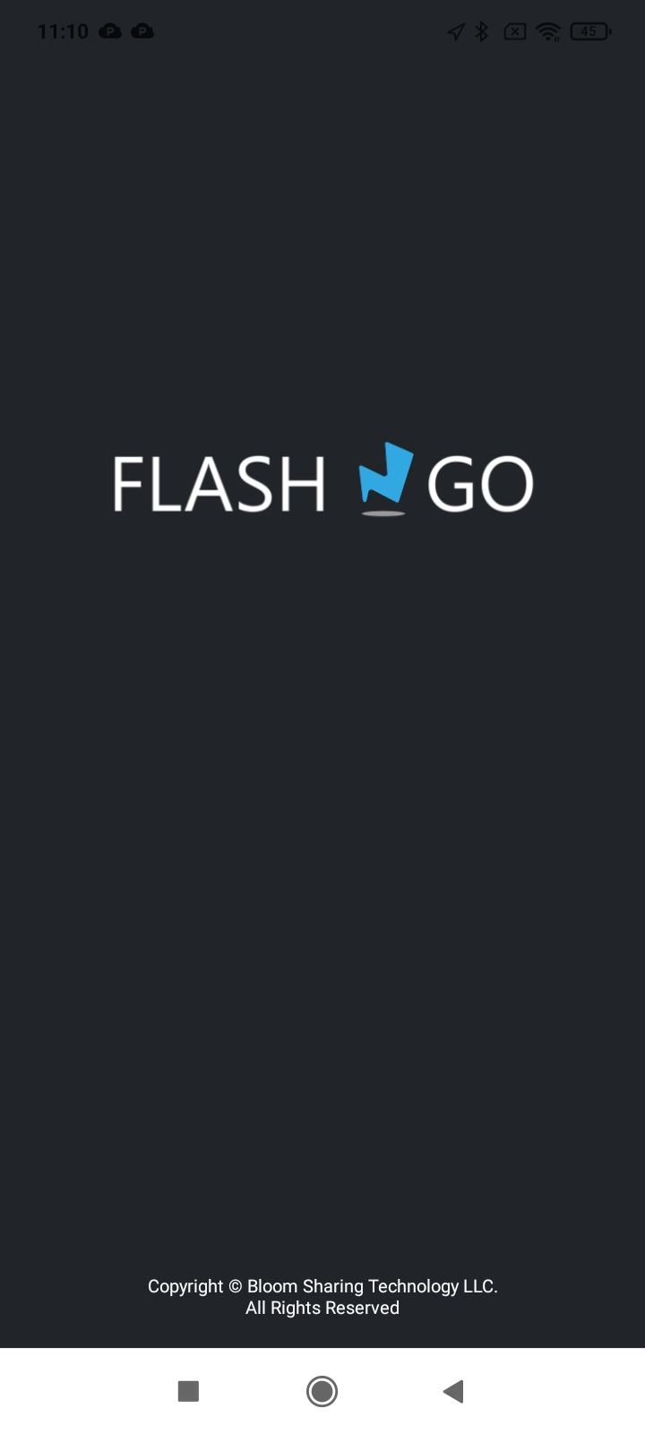
Can you please remove the bloom copyright since it is a white label.
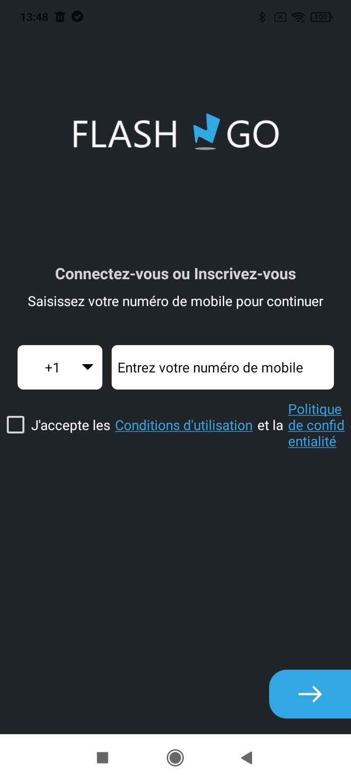
We really need to :
- Remove all the Country codes that are not allowed in the App, there is no sense in letting them on the App, it will just create fustration because customer will never receive the code....
I understand that it depends on the providers, so we will see then.
- Set the first code appearing to be +33 France <- important
After, we need to put the line below in two lines :
J'accepte les Conditions d'utilisation et la
Politique de Confidentialité.
Please make it possible to register with an email.
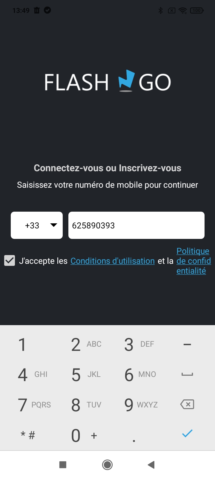
Here you can see with my french number what it looks like.
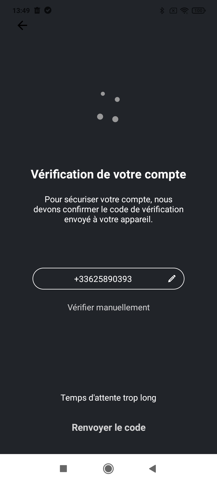
Please change the following sentence :
Pour sécuriser votre compte, vous devez confirmer le code de vérification qui vous a été envoyé par SMS.
Vérifier manuellement for "Accéder au clavier..."
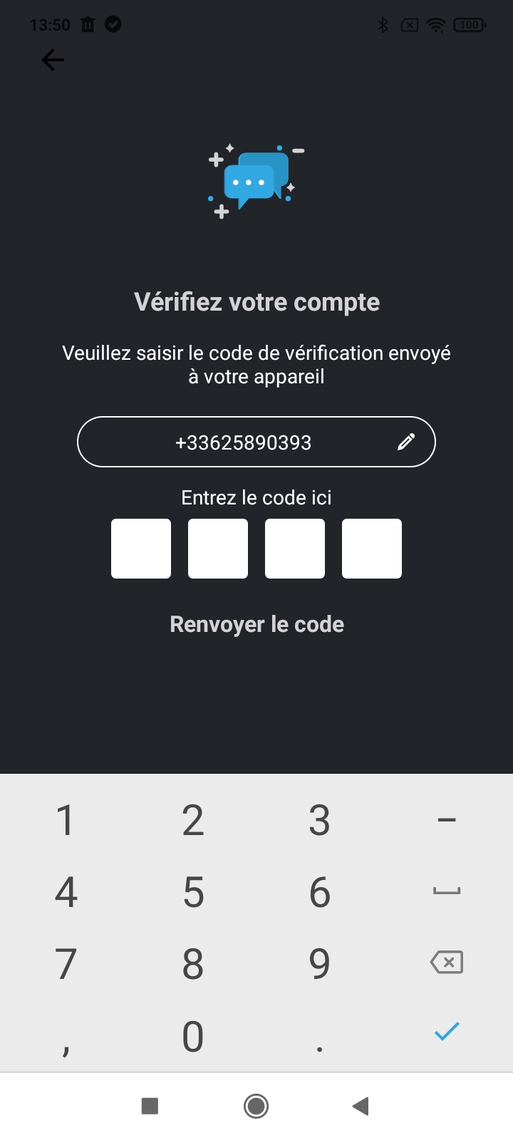
Please change the following sentence :
Entrez le code ici for "Saisissez le code sur le clavier"
Renvoyer le code for "Renvoyer le code par SMS"
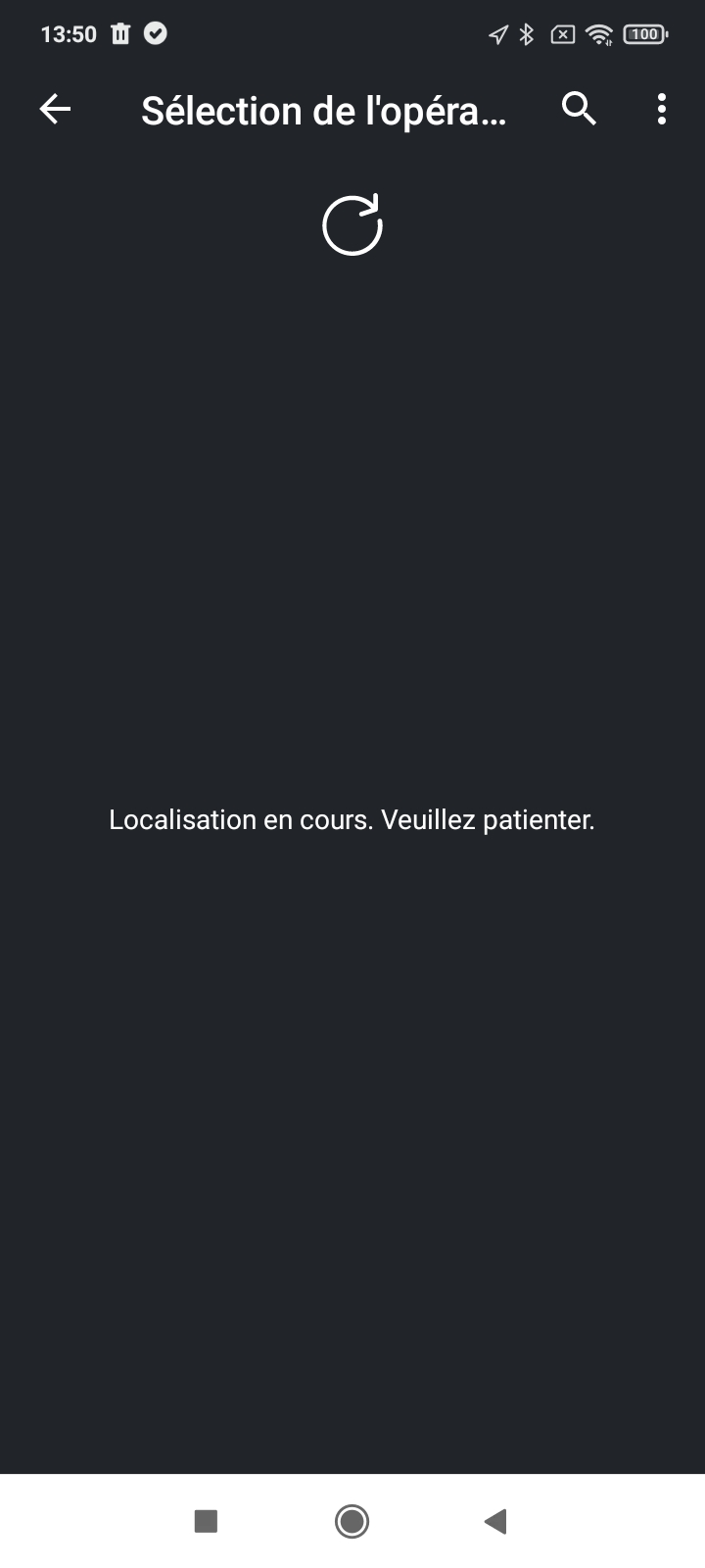
There is an issue of font size. The main word "Opérateur " is truncated.
Is it possible to remove the search button ? it does not make sense and does not work.
Please change "Localisation en cours. Veuillez patienter" for "Recherche des opérateurs disponibles. Veuillez patienter."
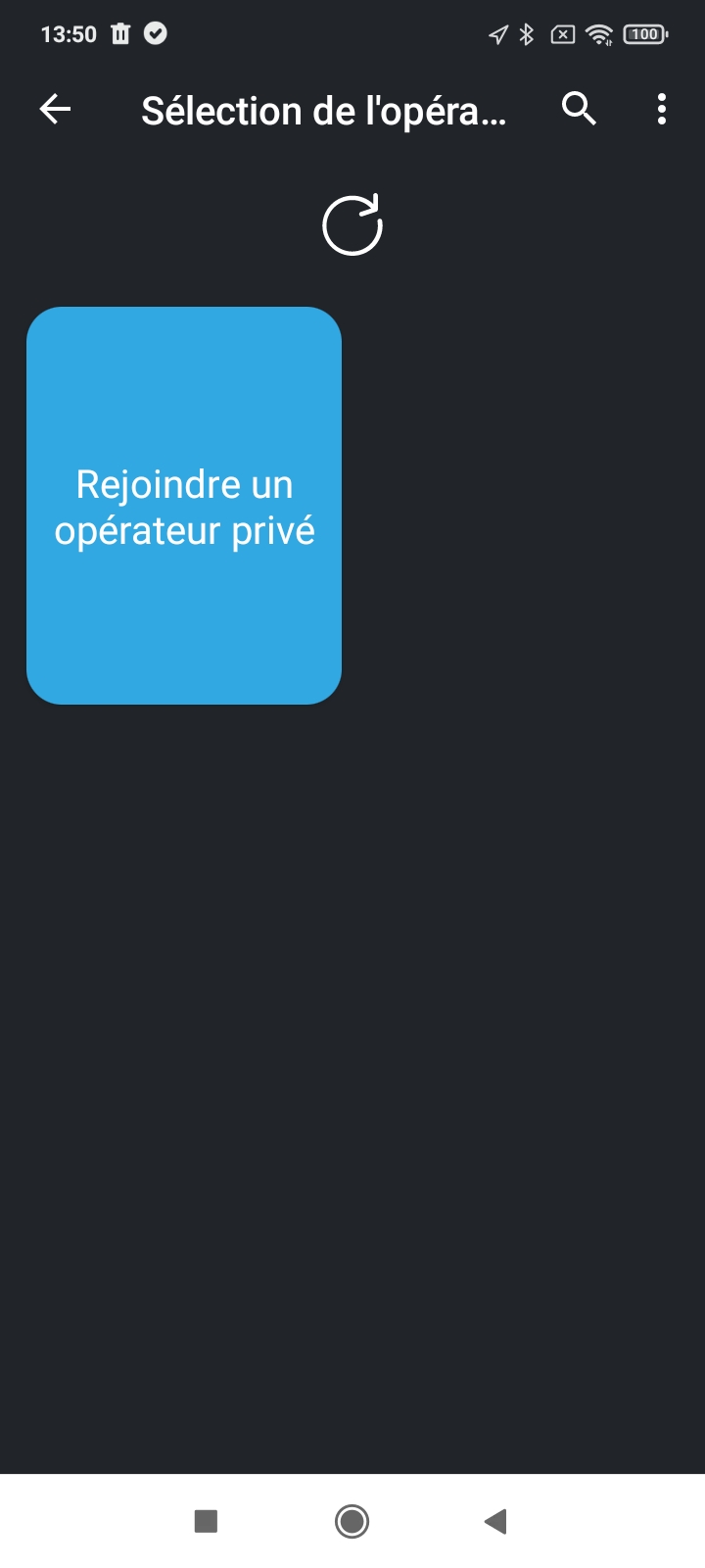
Same with the previous one for the search button. By the way, I'm not sure to understand the purpose of this button ?
Still, the design of this page is really bad, I'm sorry. What can we do to do a better design ?
"Rejoindre un opérateur privé" for "Flasher le QR Code d'un opérateur privé"
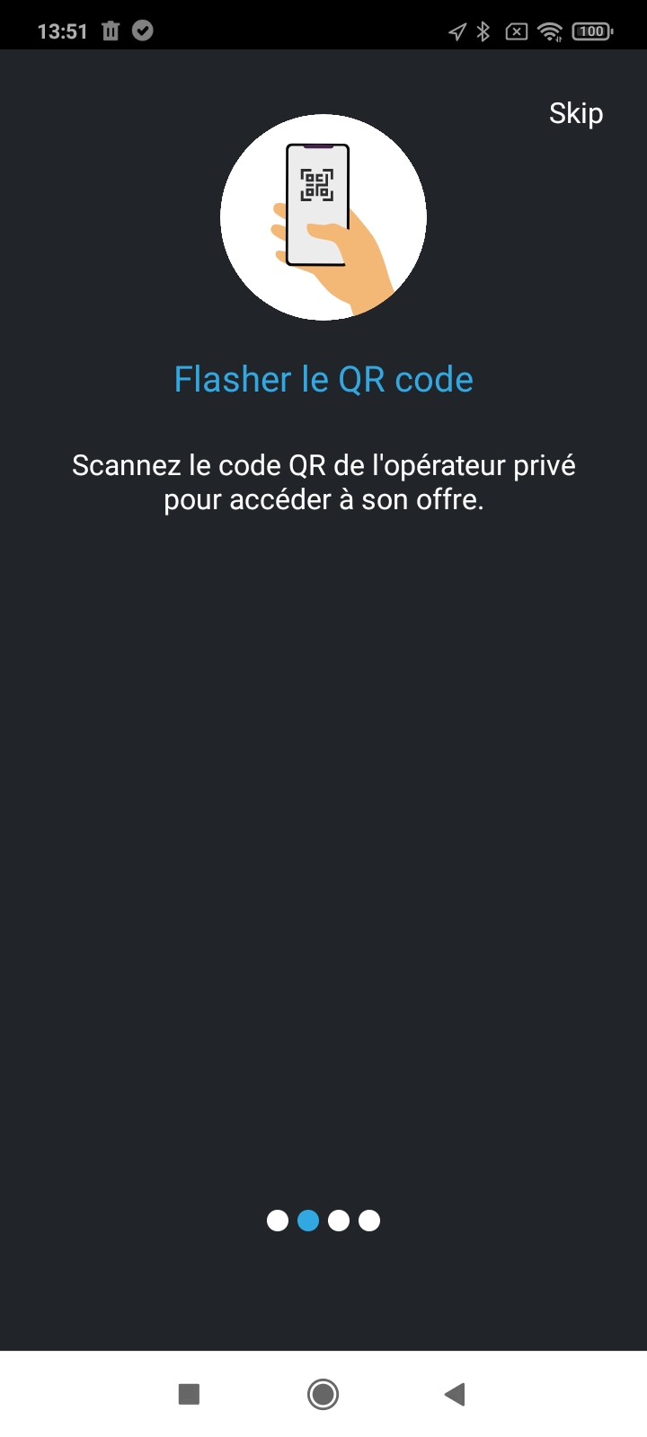
replace Skip for "Passer"
TEXT :
Afin d'accéder à la flotte d'un opérateur privé, veuillez flasher le QR Code de celui-ci. Pour cela, cliquez sur le bouton OK, Flash & GO et pointez votre téléphone vers le QR Code qui vous sera fourni par l'opérateur.
Il se peut que l'accès à cette flotte soit soumis à l'approbation de la part du responsable ce qui pourra entrainer un délai de validation.
Si vous ne trouvez pas le QR Code, veuillez contacter directement l'opérateur.
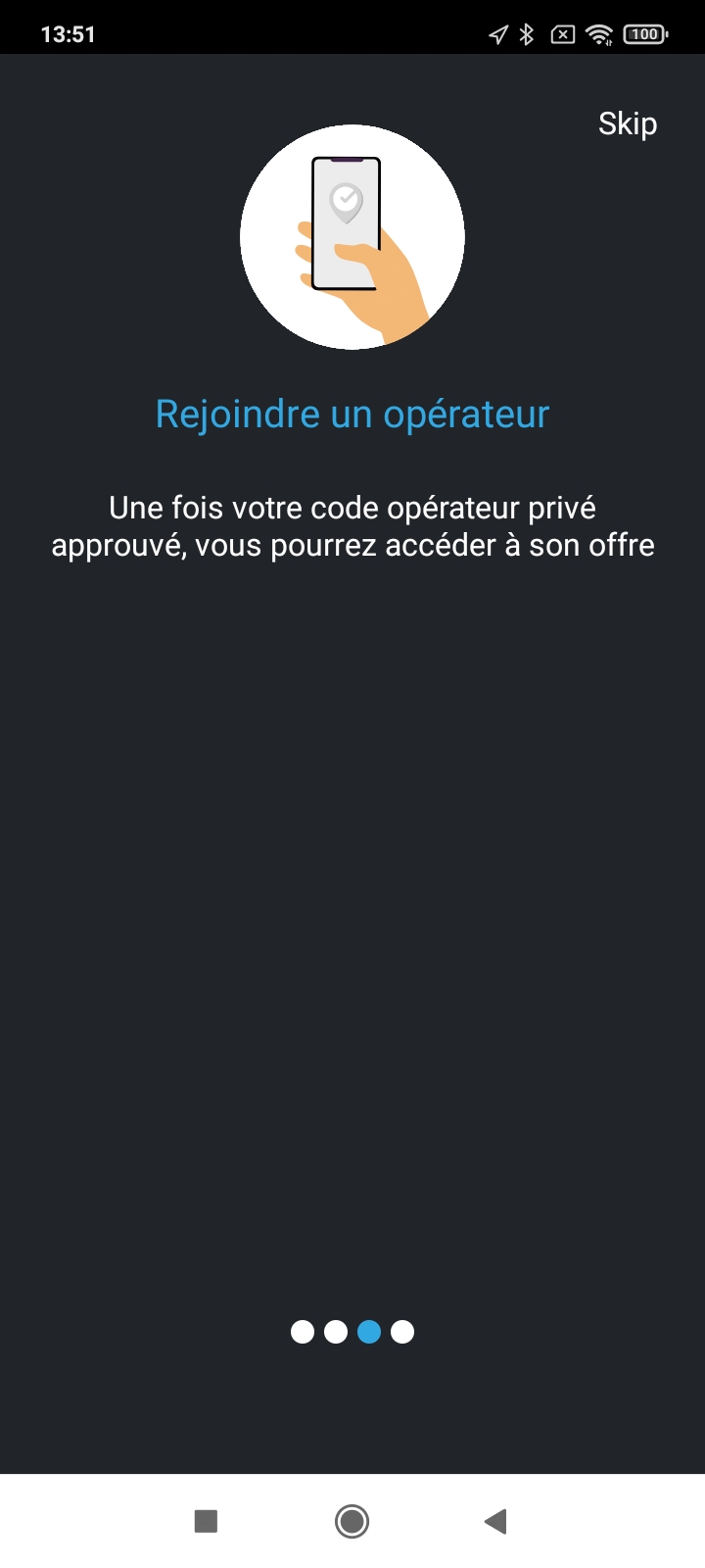
Please remove this screen.
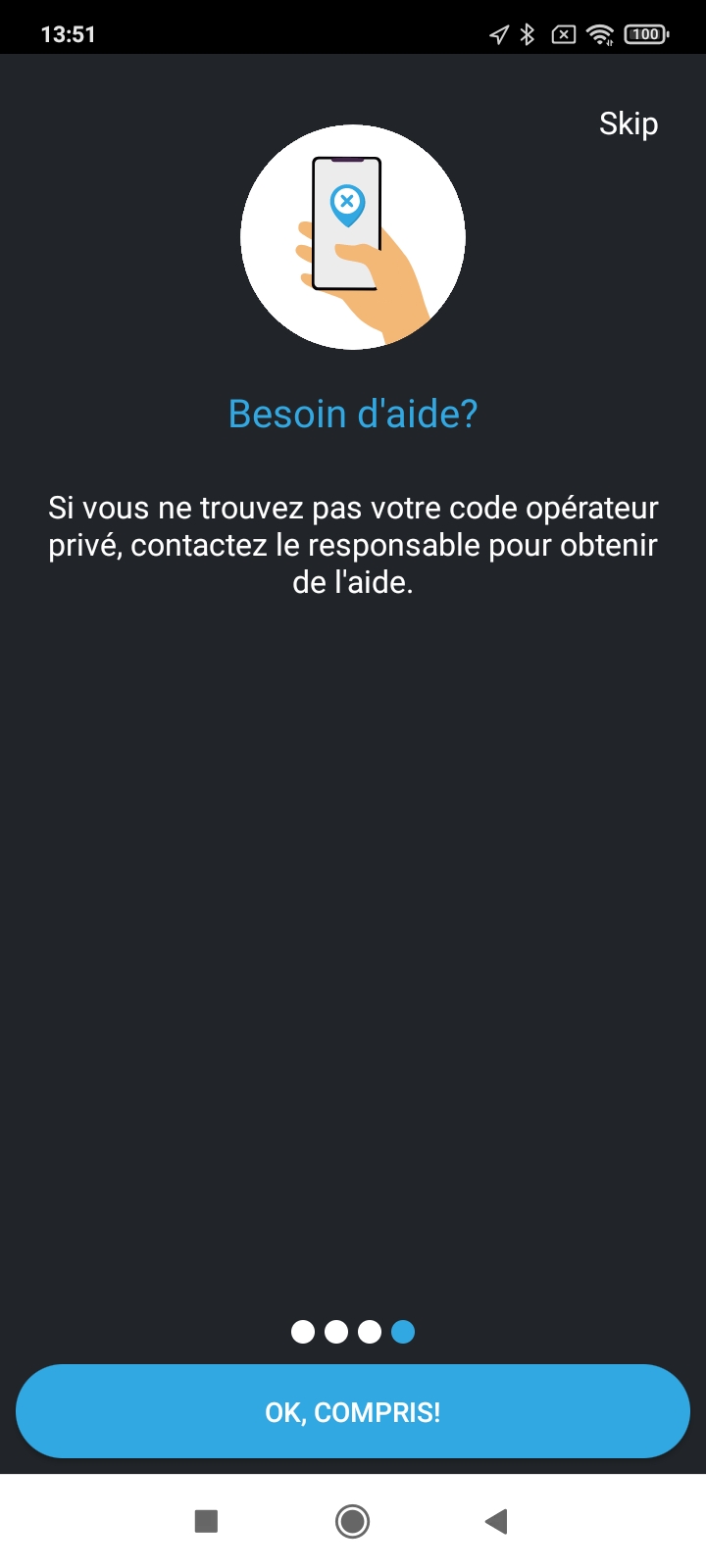
Please remove this screen.
Put the blue button on the last screen and change the text for : Flash & GO
So we go from 4 to 1 screen.
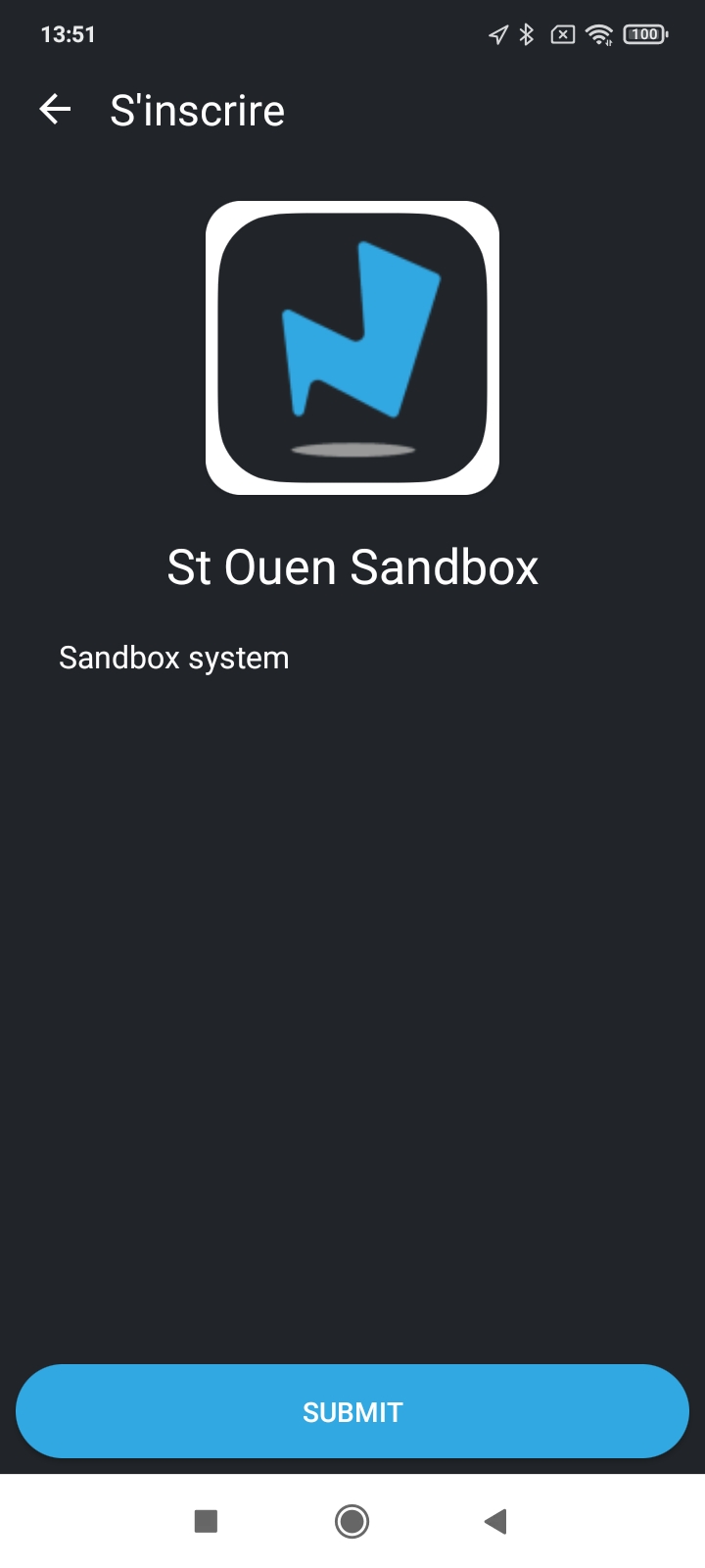
Please change "S'inscrire" for
Liste des opérateurs
Change SUBMIT for ACCÉDER
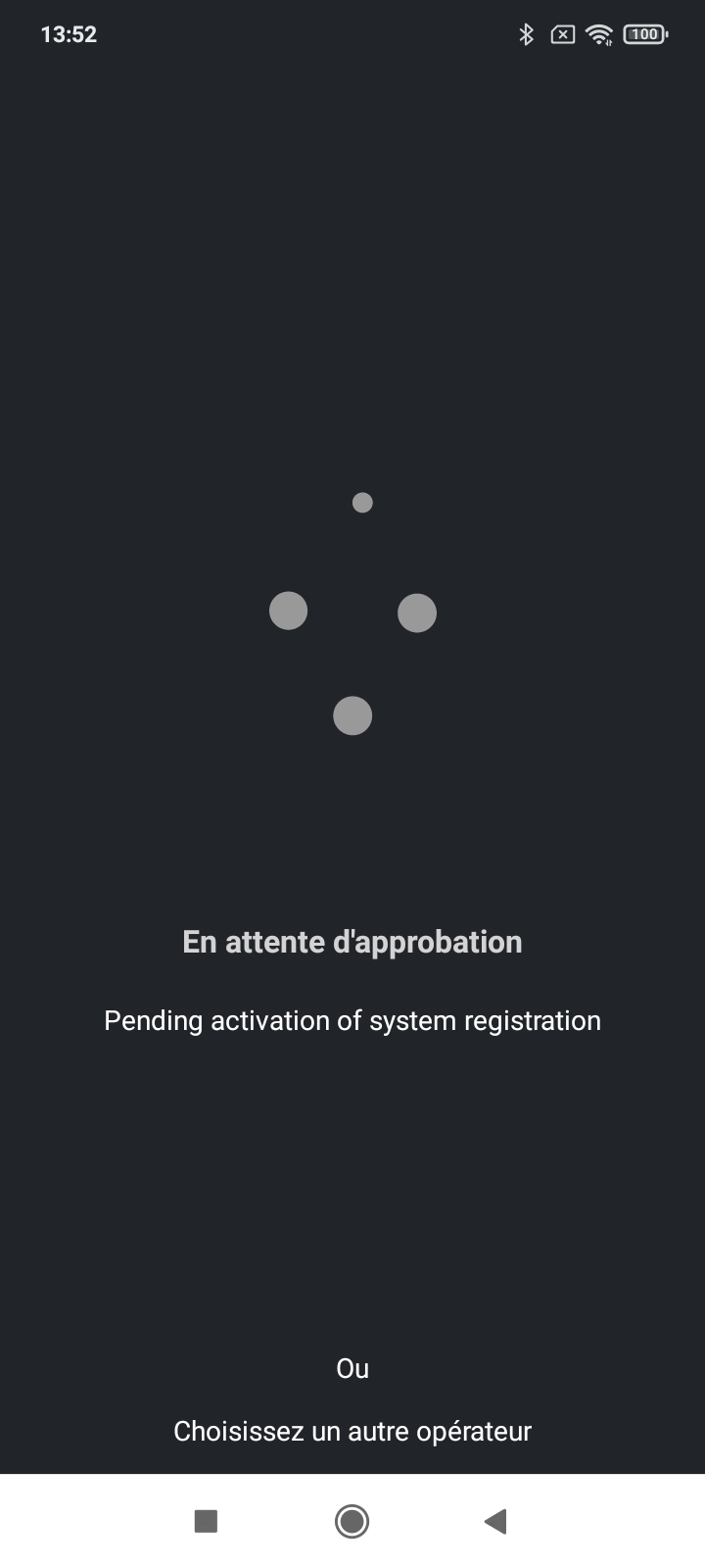
Please change "En attente d'approbation" for
En attente de validation...
Please change "Pending activation of system registration" for
Votre demande est soumise à la validation de l'opérateur.
Change Choisissez un autre Opérateur for
Revenir à la liste des opérateurs.
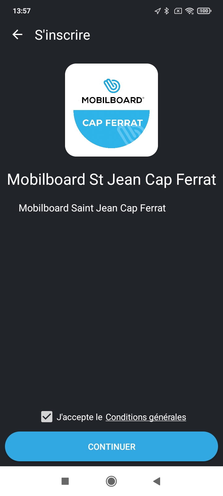
Please change "S'inscrire" for
Liste des opérateurs
For the description of the operateur, that would be very useful that it becomes HTML Code. We could put pictures, maps etc...
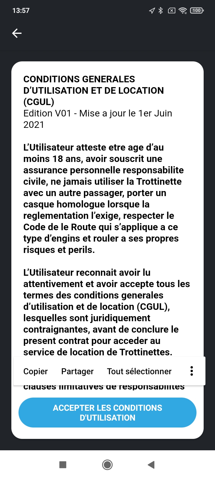
We still have issues with this text with the iPhone. Please check if the accents are all right.
Please change :
ACCEPTER LES CONDITIONS D'UTILISATION for
ACCEPTER LES CONDITIONS GÉNÉRALES
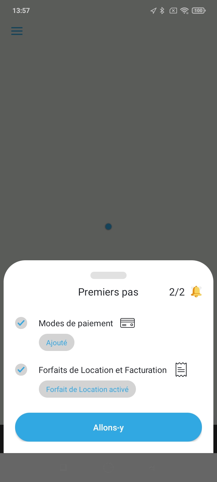
Please change :
"Premiers pas” for
Etapes de validation :
“Ajouté” for
Carte ajoutée
"Allons-y" for
CONTINUER
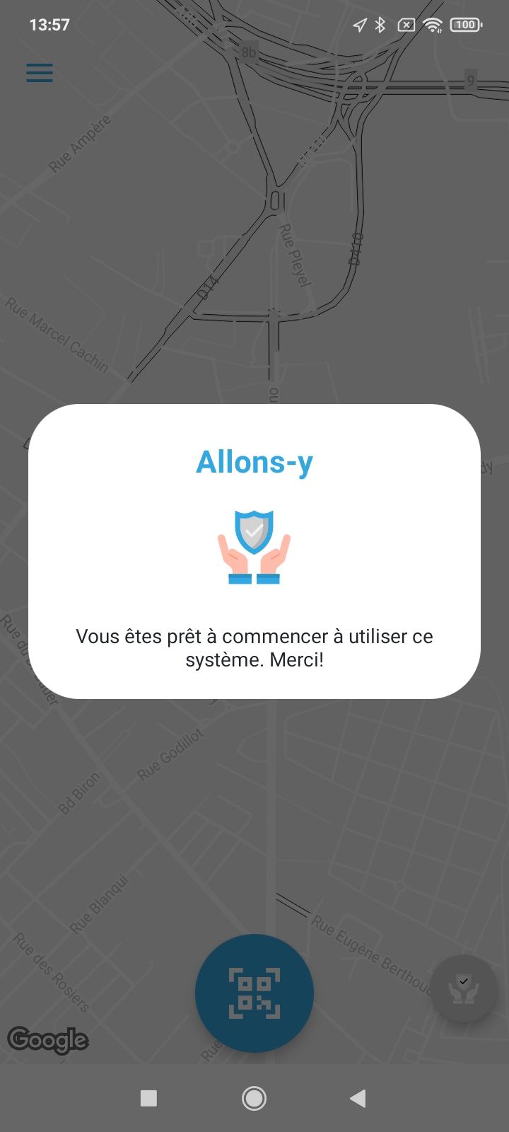
Please change :
"Allons-y" for
Félicitations
TEXT Centered for
Tout est paré pour commercer votre location,
veuillez appuyer sur le bouton bleu
pour Flasher un QR Code.
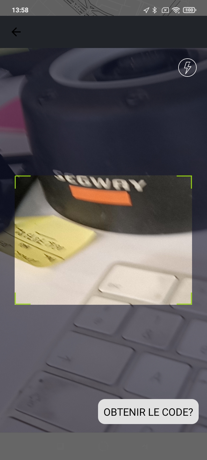
On all camera pages for QRCode scan, please change the text for :
Insérer le code manuellement...
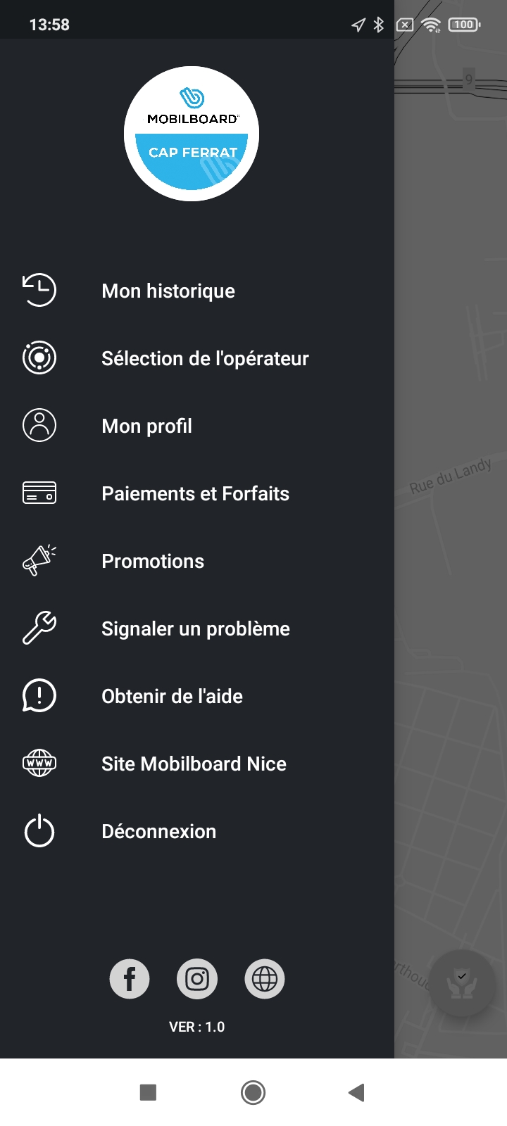
please replace :
"Mon historique" for Mes locations
"Sélection de l'opérateur" for "Changer d'opérateur"
"Mon profil" for Mon compte
"Paiements et Forfaits" for Forfaits et Moyens de paiement"
"Promotions" for Réductions
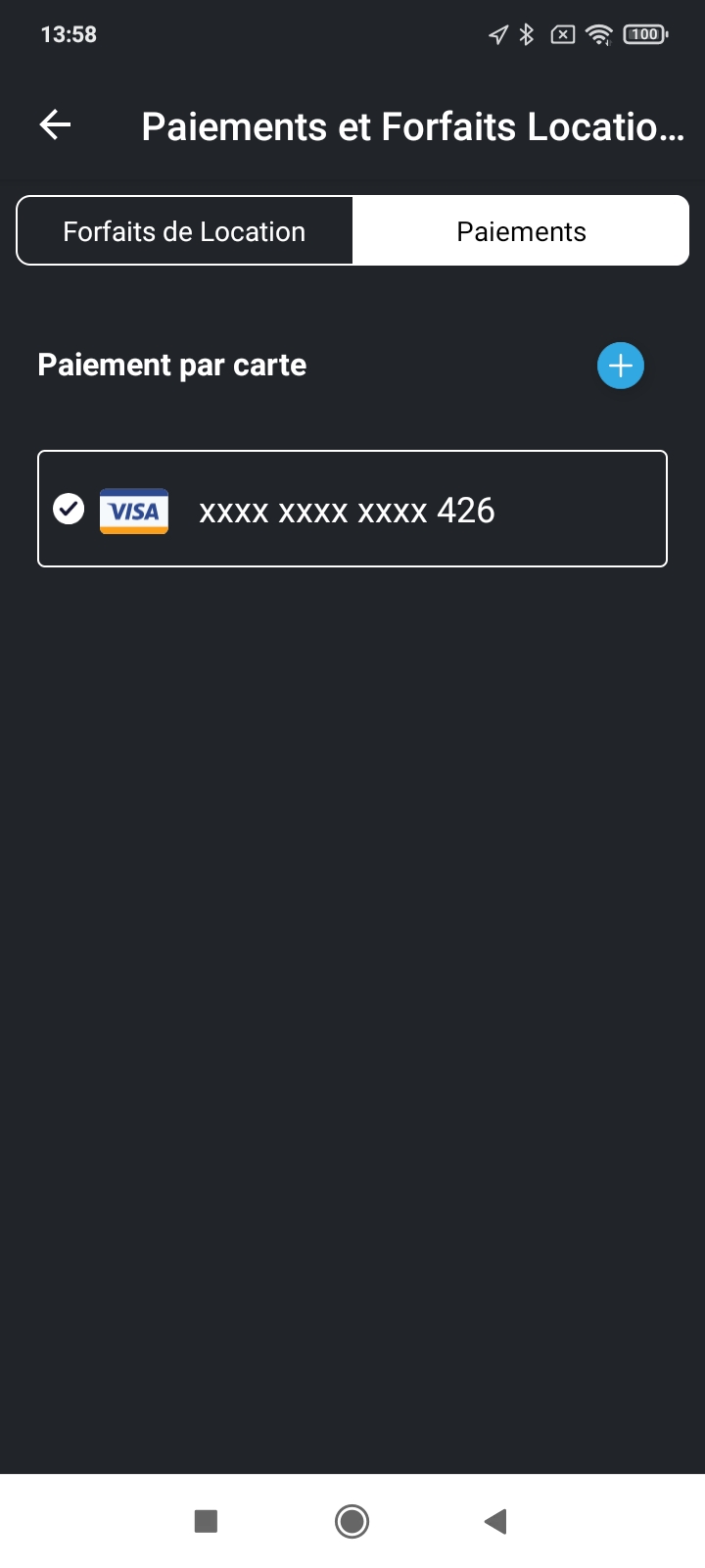
please replace title for "Forfaits & Moyens de paiement" please lower the font.
"Paiements" for "Cartes de paiement"
"Paiement par carte " Ajouter une carte de paiement :"
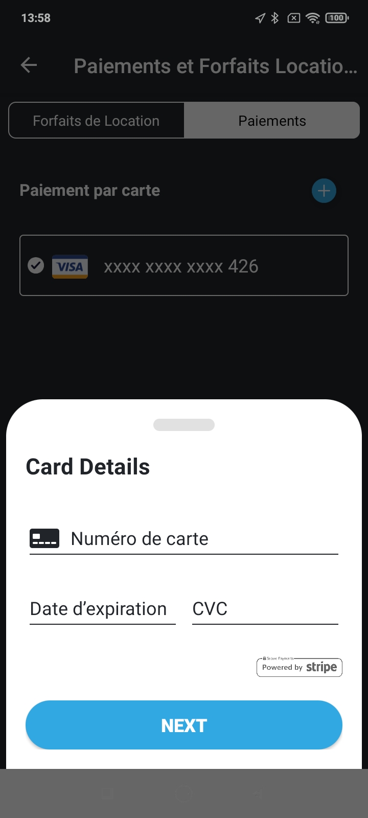
replace "Card Details" for "Informations de la carte"
NEXT for "VALIDER"
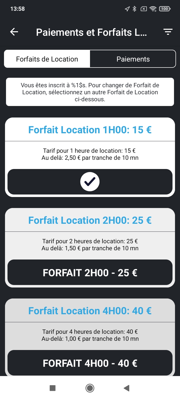
This is the most critical page we need to see an evolution. This is important because right now, it does not make any sense, it is not clear at all.
Replace "Paiments et Forfait" by the System Name, please change the size of the title.
For the PLANS :
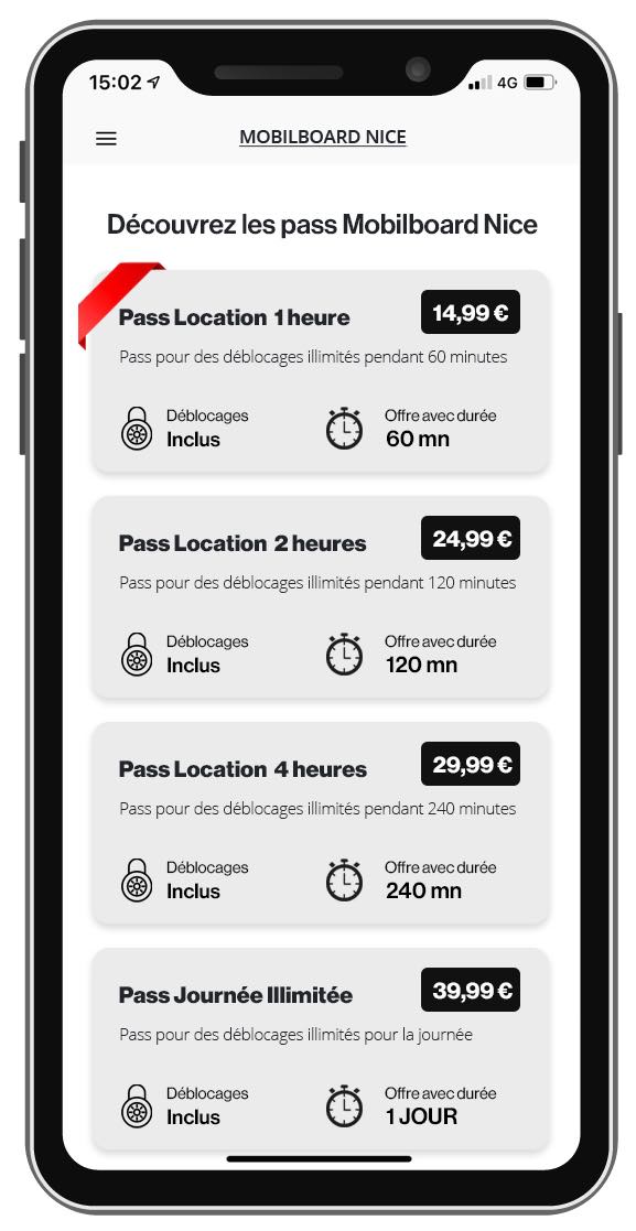
Besides title and the Text, we need to show much more informations. There is not need to put a long text to explain what it does we need to put recognizable icons defining :
Price tag
Unlock price :
Free time :
Overtime price :
see inspiration on the right.
For the Button, there is button TEXT OK
When selected, please change the √ for Forfait sélectionné
Can you change the background of the selected plan with a very light grey color ?
or nice red rubban on it.
Sidenote, the fact that we can sort the plans in the dashboard as we please is very very important.
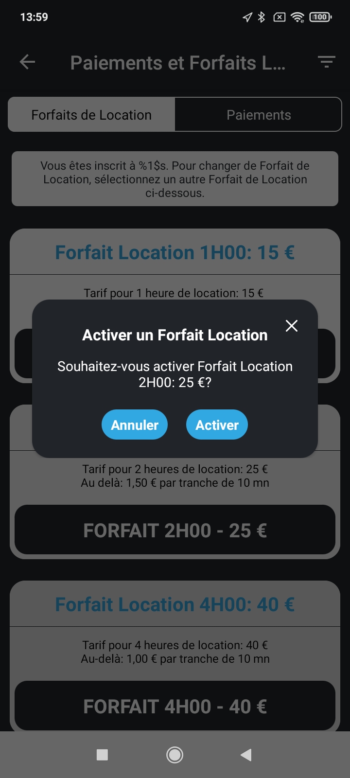
Change "Activer un Forfait Location" for
Souscrire à un forfait de location
TEXT : Souhaitez vous soucrire au PLAN TITLE ? (don't forget the space between last caracter of PLAN TITLE and ?
Please grow the two buttons and make them a bit less round.
Change Activer for Souscrire et Payer
Also we believe that here is the best place to put much more informations on the plan. The possibility between the title and the current text to pour few lines of HMTL formated code to put picture, photo, and formated text. Can you do that ?
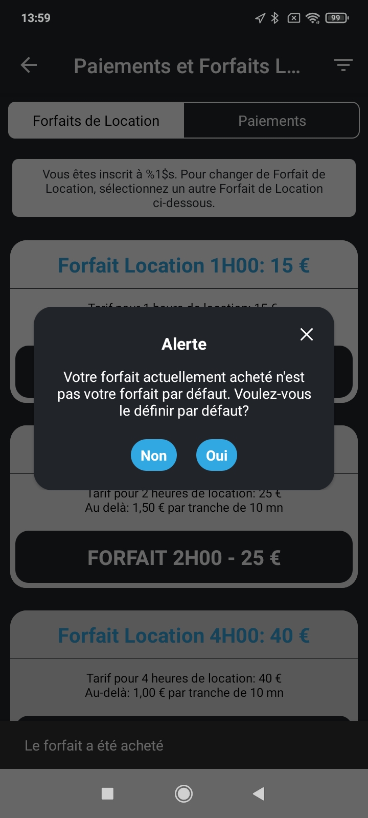
We still don't understand why you have those Default plans and so on.
Can't you make a plan that you have just selected directly the default plan ?? without this unnecessary dialog ?
if not please change for now the text for :
Alerte for Forfait sélectionné
Text:
Le forfait que vous venez de choisir n'est pas le forfait actuellement utilisé. Voulez vous sélectionner ce forfait afin de l'utiliser pour votre location ?
Please grow the two buttons.
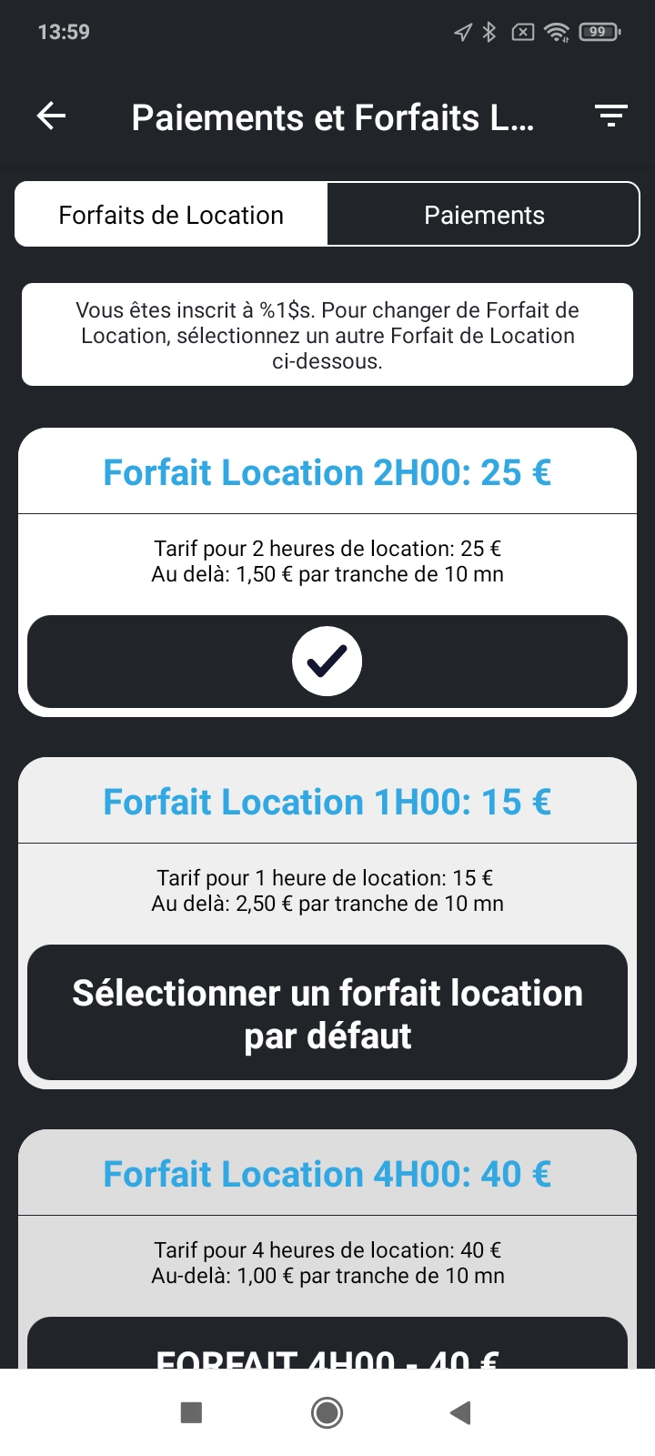
This is so not intuitive.
We can barely read the text related to the default plan :
"Vous êtes inscrit à xxx. Pour changer de Forfait de Location, sélection...etc".
This does not make any sense. Please change that. Like the red ribbon or something else to directly show what is directly selected...
by the way, I imagine that is the one just below this sentence, right ?
Now there is the line "Sélectionner un forfait location par défaut".
Please change for : "Sélectionnez ce forfait pour l'utiliser maintenant…”
For the three litle lines on the upper right, please put an icon of a very small scooter instead. This is like sorting descendant the plans, does not make sens. I wondering if we should not remove the icon completely and only make ONE kind of vehicule systems..
We really need to exchange on what you can do about this screen It is an important screen and there is work to do to change it.
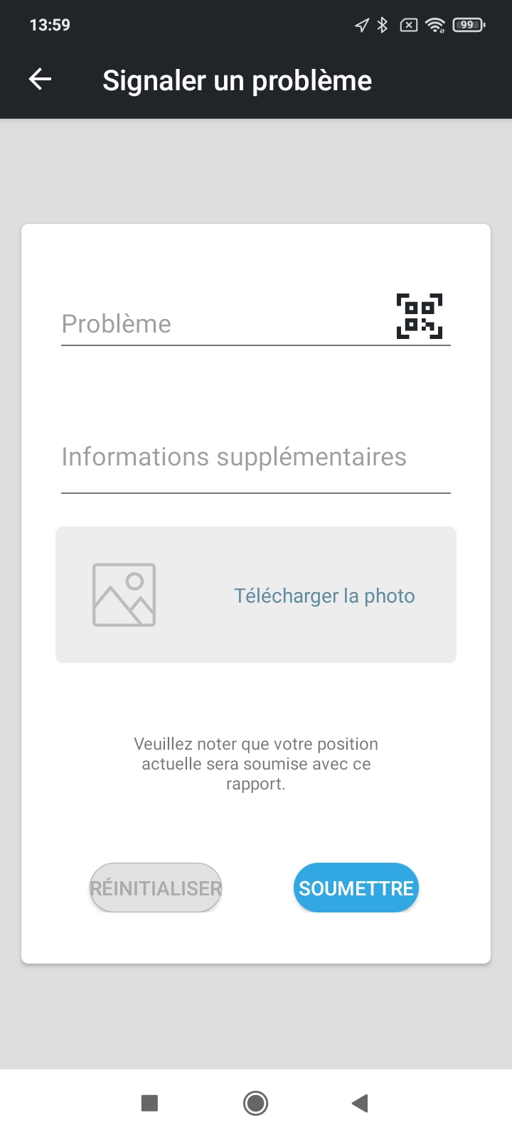
I believe the fonts are not at the proper size, based on the bloomsharing app.
The fields are also not very clear.
Replace "Problème” for
QR Code
Replace “Informations supplémentaires” for
Description dU problème
Replace “Télécharger la photo” for
Envoyer une photo
The buttons are too small for the text.
Replace Réinitaliser for EFFACER
Replace SOUMETTRE for ENVOYER
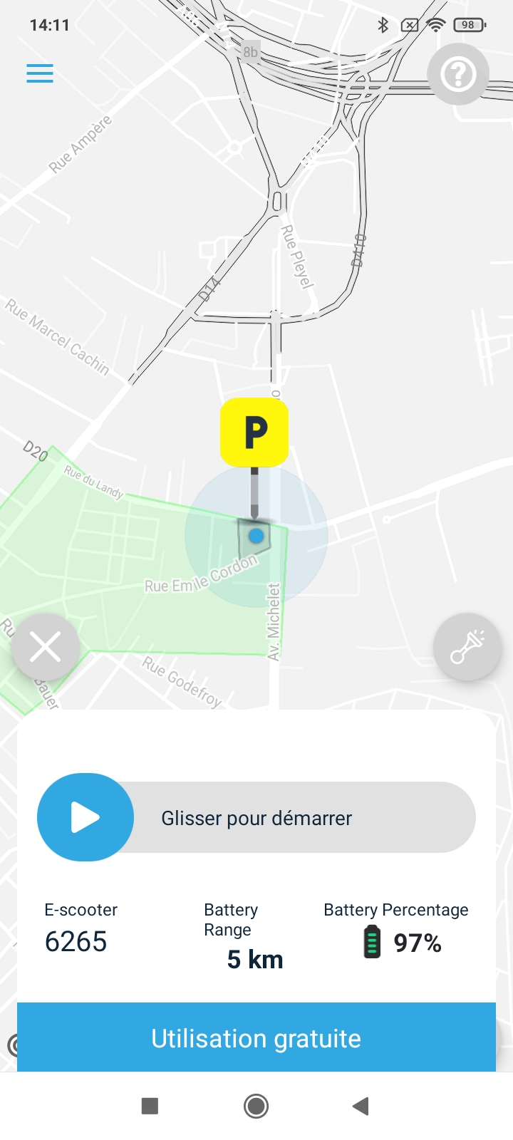
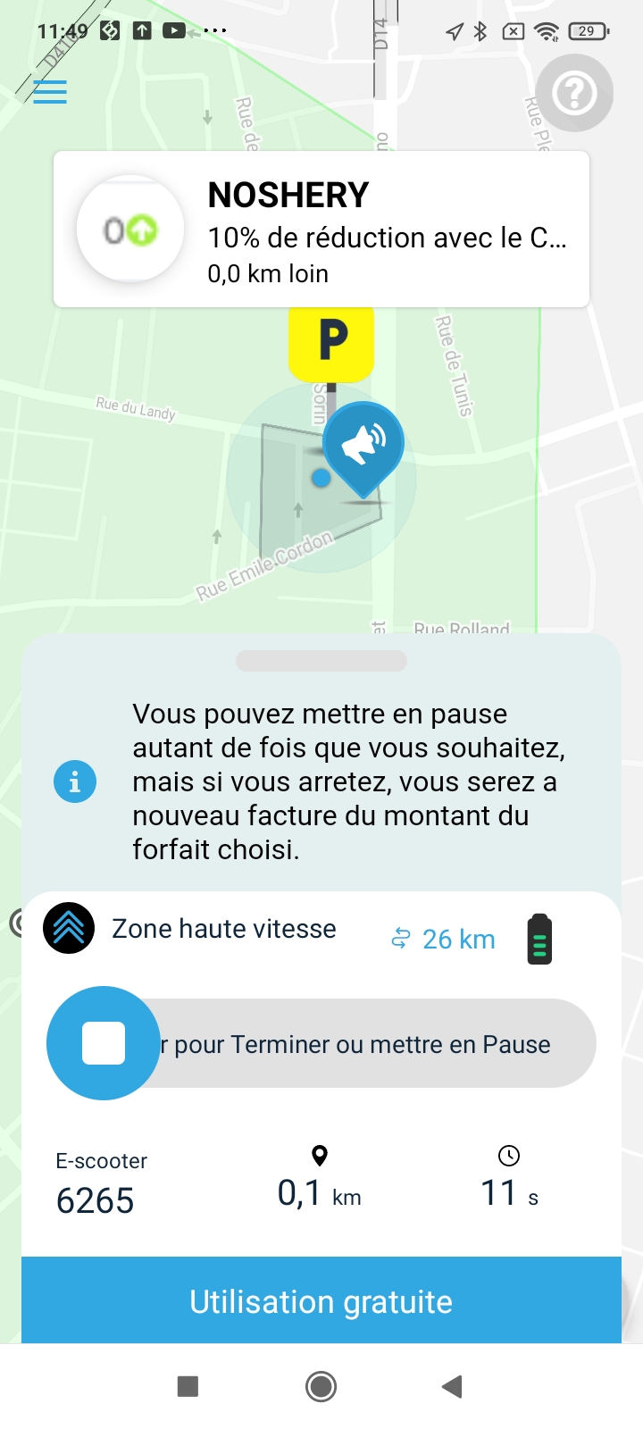
E-scooter for Kickscooter
Battery range for Autonomie
Battery percentage for Batterie
UPCASE GLISSER POUR DÉMARRER
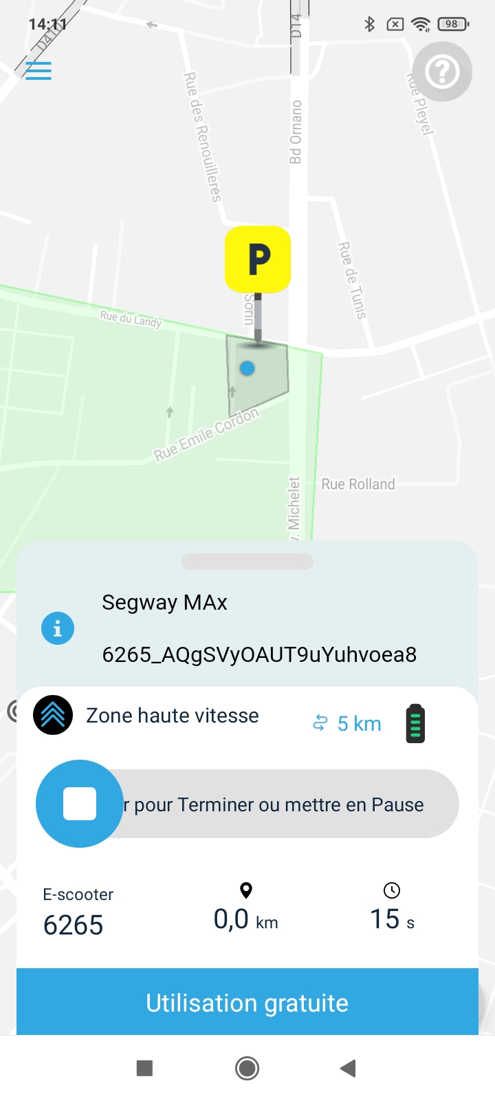
Zone haute vitesse for "Vitesse normale"
Glisser pour Terminer ou mettre en Pause for GLISSER POUR SE GARER
E-scooter for Kickscooter
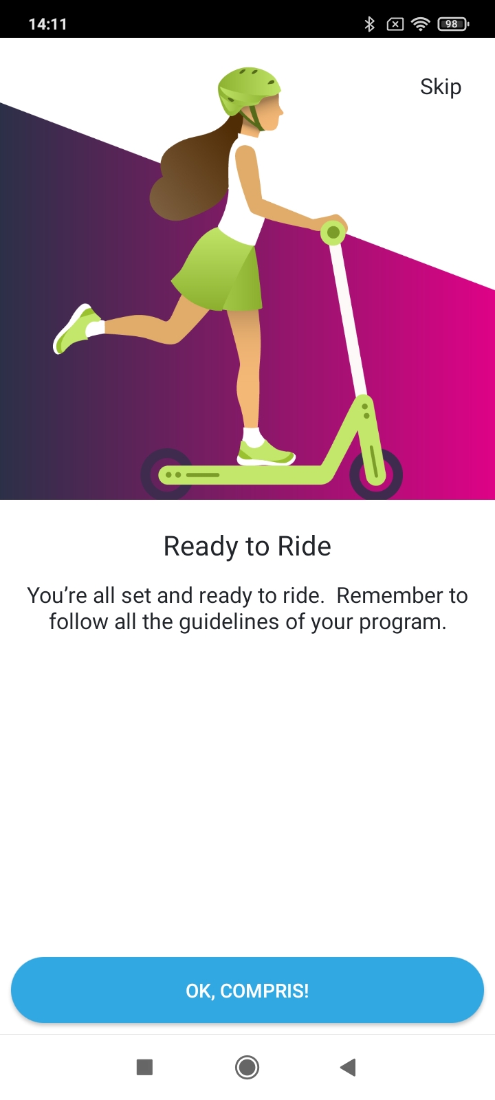

Everywhere, change Skip for Passer
The button, OK, COMPRIS! for CONTINUER
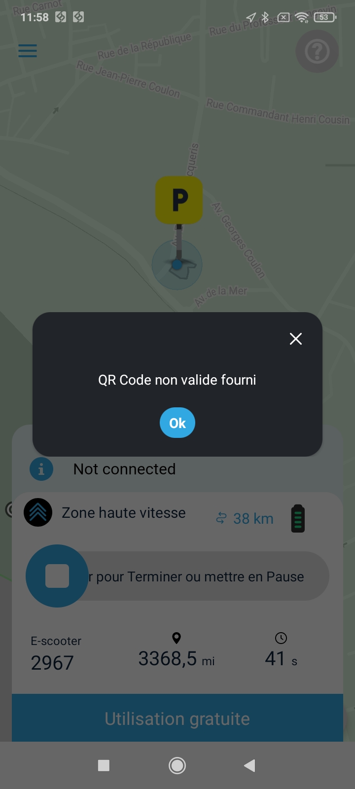

Please change for :
QR Code scanné non valide.
Grow the OK button.
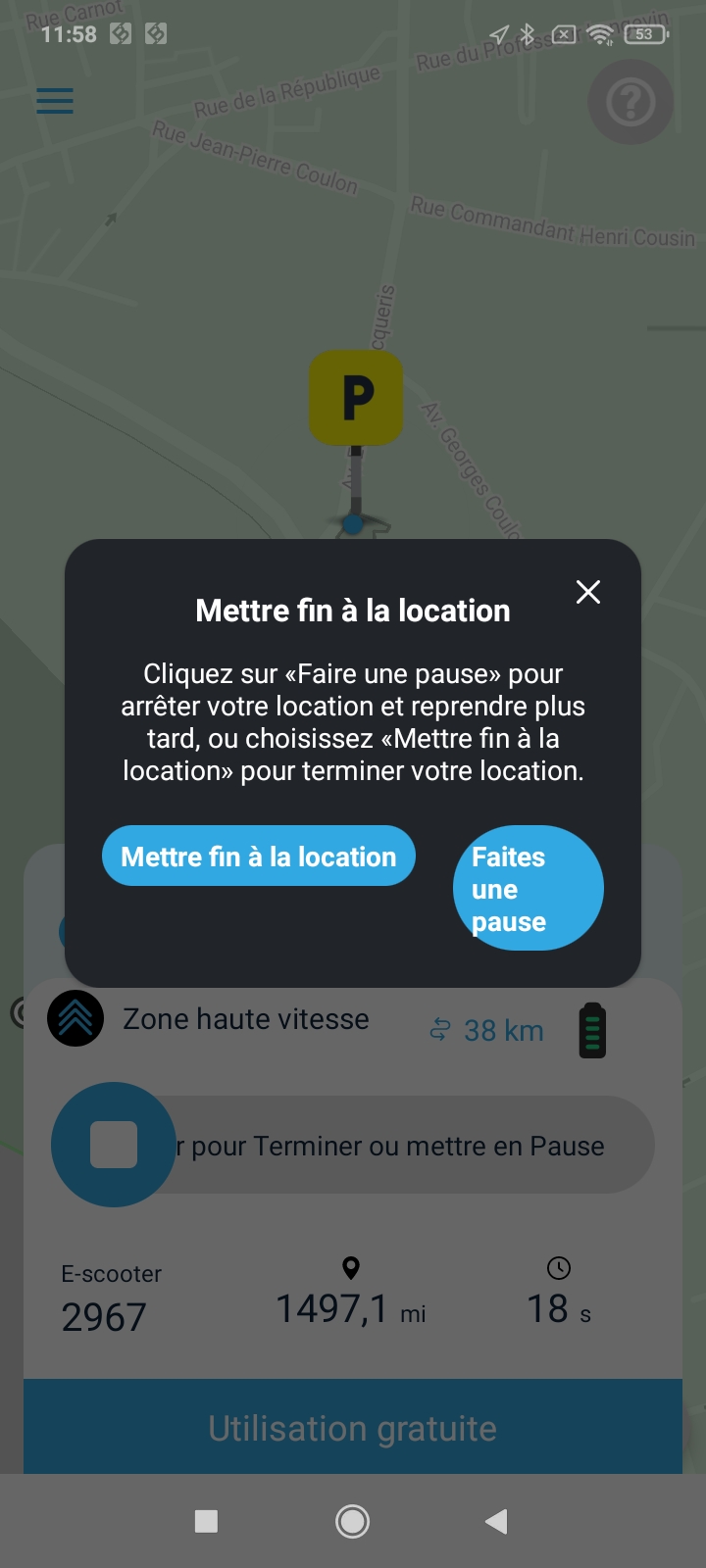
Title : Pour s'arrêter...
TEXT :
Si vous souhaitez finir votre location, vous pouvez cliquer sur "Finir la location".
Si vous souhaitez vous arrêter pour reprendre plus tard, alors cliquez sur "Faire une Pause"
Change buttons :
FINIR LA
LOCATION
FAIRE UNE
PAUSE
please resize them so they are same size, put both on two lines.
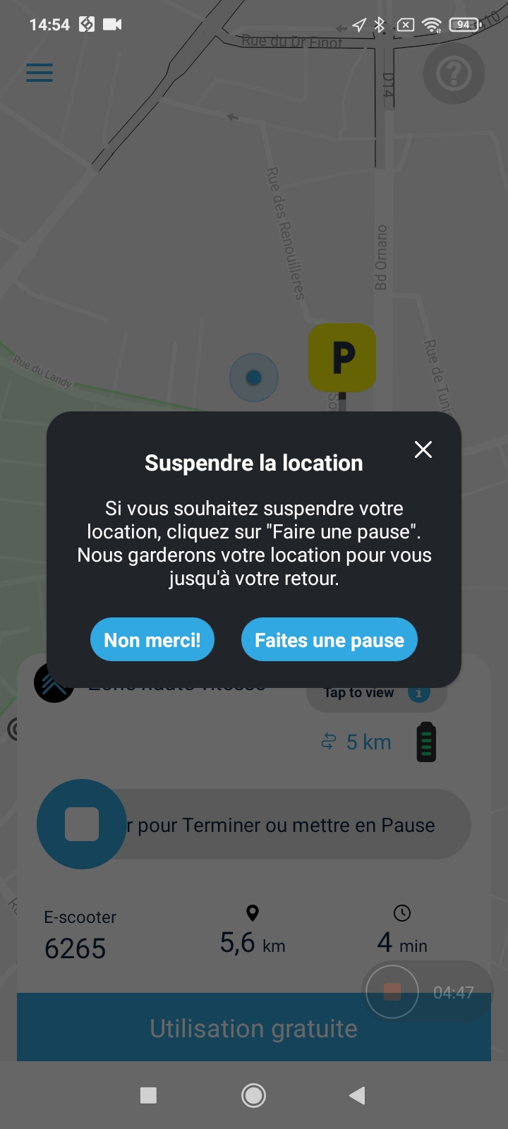
French text :
Si vous souhaitez faire une pause, cliquez sur "Faire une Pause" et votre véhicule sera vérouillé mais votre location restera active jusqu'à votre retour.
Attention : Pendant la pause, le temps de location est toujours décompté.
Buttons :
Annuler
Faire une Pause
A bit bigger
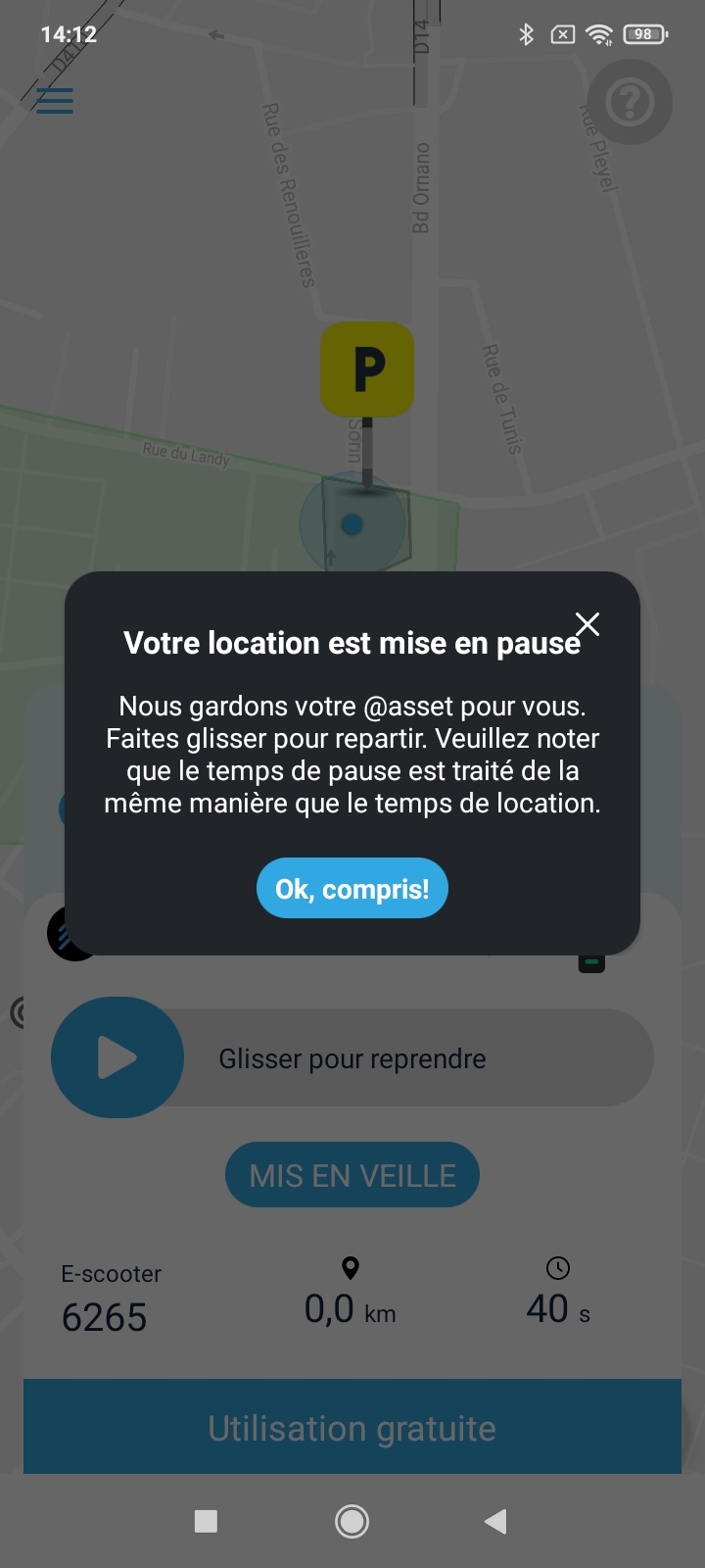
Title : Pause activée.
Text : Ce véhicule est actuellement vérouillé mais il reste votre véhicule pour cette location. Veuillez noter qu ele temps de pause est considéré comme de la location et par conséquent décompter comme du temps de location.
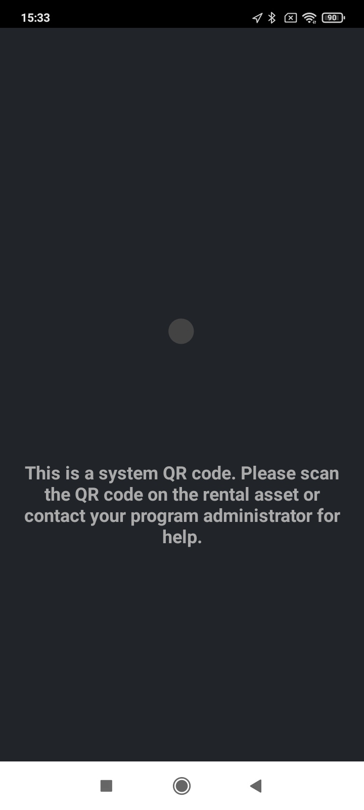
French text :
Ceci est le QR Code d'un opérateur et non pas d'un véhicule. Veuillez flasher le QR Code d'un véhicule de la flotte ou à défaut contacter l'opérateur pour avoir de l'aide.
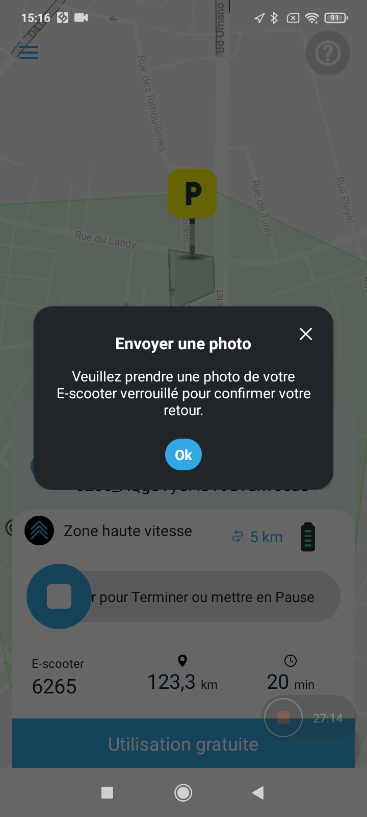
French text :
Title : Photo de contrôle
Veuillez prendre une photo du véhicule que vous avez utilisé pour valider son retour et cloturer la location.
Grow the OK buttons
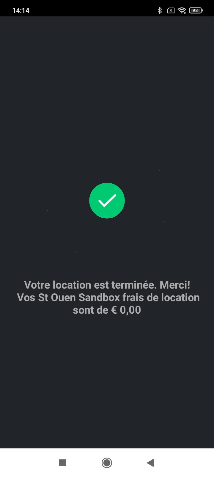
Please change the text for :
Votre location est terminée.
Les frais pour cette location sont de x,xx €.
Nous vous remercions d'avoir choisi &SYSTEM .
Can you put more that One line for the ads ?